L o a d i n g
Case Study

Mylio Photos

Case Study Mylio Photos

Mylio Photos is a photo management app designed to organize, protect, and access photos across devices. While it has powerful features, user reviews and personal experience highlighted issues with discoverability, usability, and interface clarity.


This case study details how I redesigned the right toolbar and side panel of the Mylio Photos desktop app to create a clearer, more consistent, and user-friendly experience.

Role:
UI/UX Designer
Tools:
Figma, Illustrator
Timeline:
1 sprint (2 months)
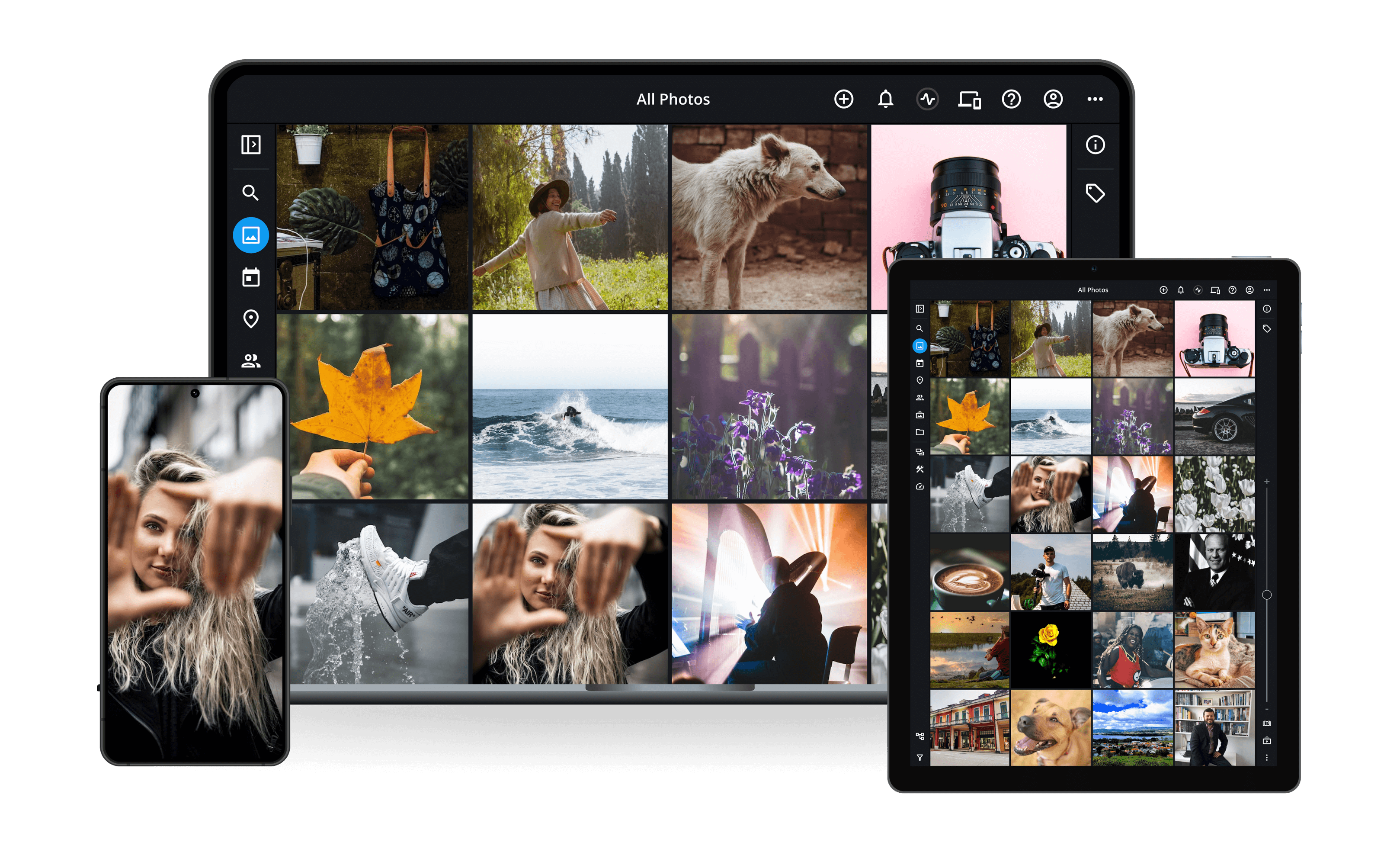
Mylio Photos running on a laptop, tablet and phone, showing the All Photos grid view

1

The Challenge

Reviews and firsthand experience exposed gaps in discoverability, usability, visual consistency, and clarity across the right toolbar and side panel.
  • When the right side panel opens, the toolbar tools move into the panel, disrupting their familiar placement and visibility, which violates Jakob’s Law.

  • Insufficient space for toolbar expansion.

  • The expanded right side panel shows inconsistent section headers, typography, colors, and field layouts.
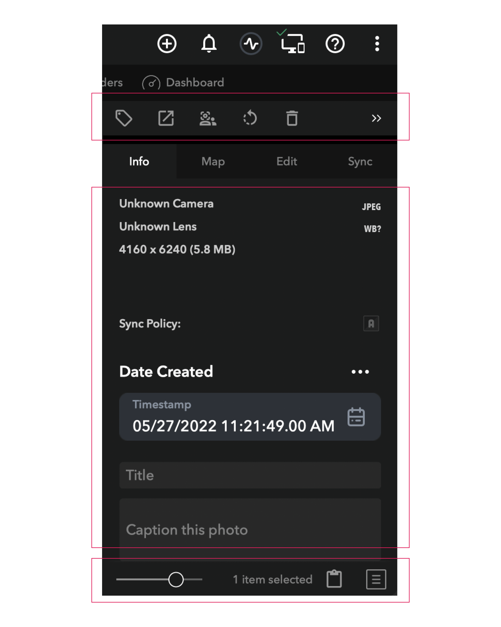
The original Mylio right side panel, with red outlines marking the toolbar, metadata fields and status bar identified as problem areas
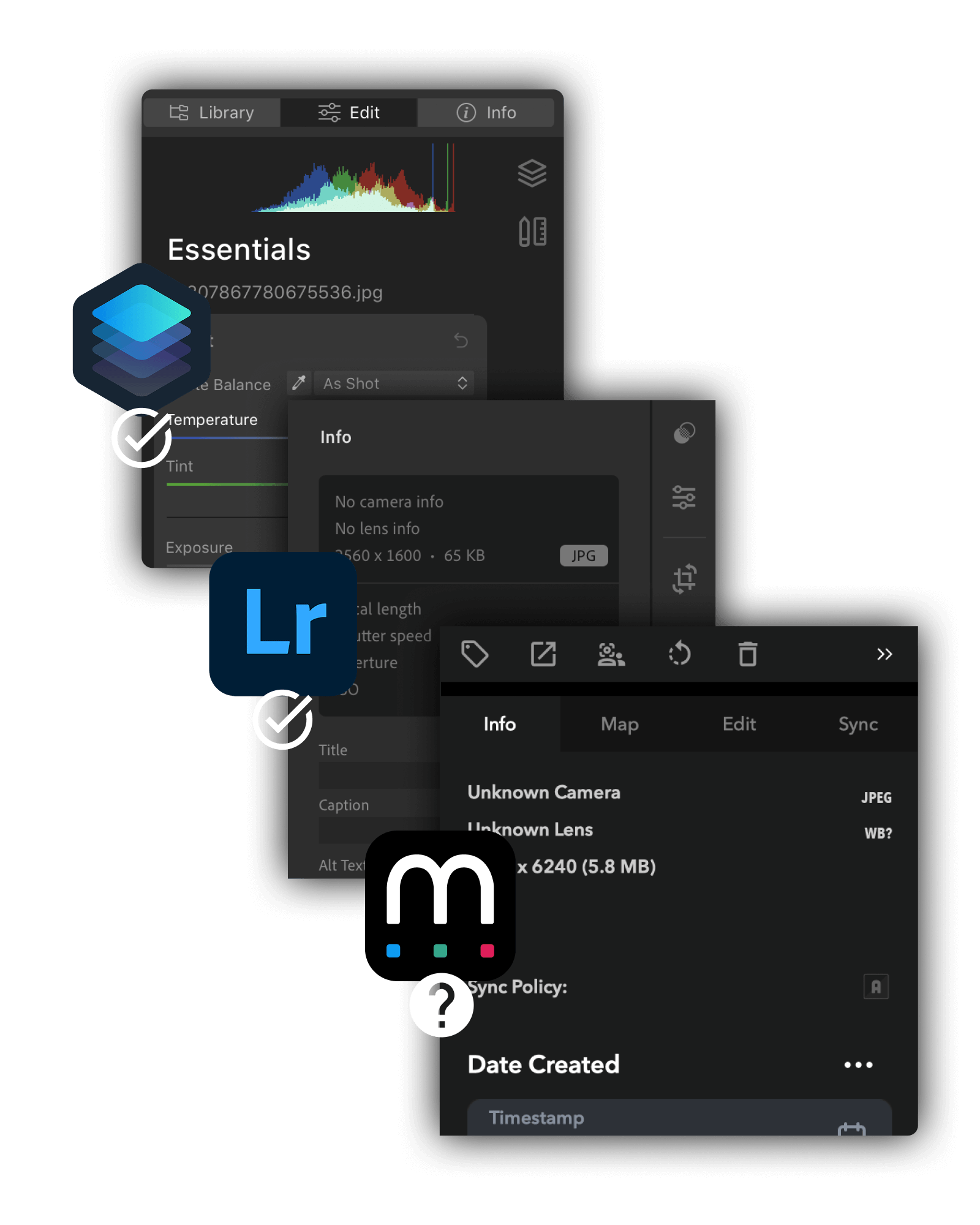
Competitive analysis comparing the photo info panels in Apple Photos, Adobe Lightroom and Mylio

2

Research & Discovery

Methods
  • Competitive analysis of Adobe products (Lightroom, Photoshop) and other photo management software.

  • Heuristic evaluation of the current Mylio Photos app.

  • Insights from Mylio app users gathered through reviews, forums, support materials, and interviews with like-minded photo enthusiasts.

Key Insights
  • Users seek a clean, consistent UI that enables easy access and editing of tools without losing focus, while ensuring the interface is highly scannable.

  • Users arrive with expectations already shaped by tools like Lightroom and Photoshop.

  • The toolbar should be designed to accommodate future expansion.

  • Keep headers, typography, colors, and fields consistent in the side panel.

3

Design Goals

  • Optimize the right toolbar and side panel to align with familiar patterns from other photo management apps.

  • Keep the toolbar always visible and display dynamic actions according to the user’s selection.

  • Maintain uniform headers, fonts, colors, and field layouts within the side panel.

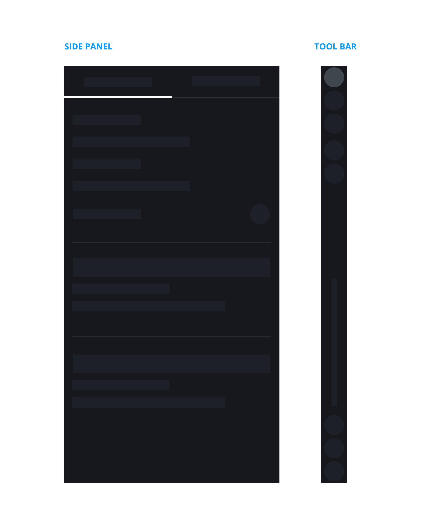
Low-fidelity wireframe separating the side panel from a persistent vertical tool bar
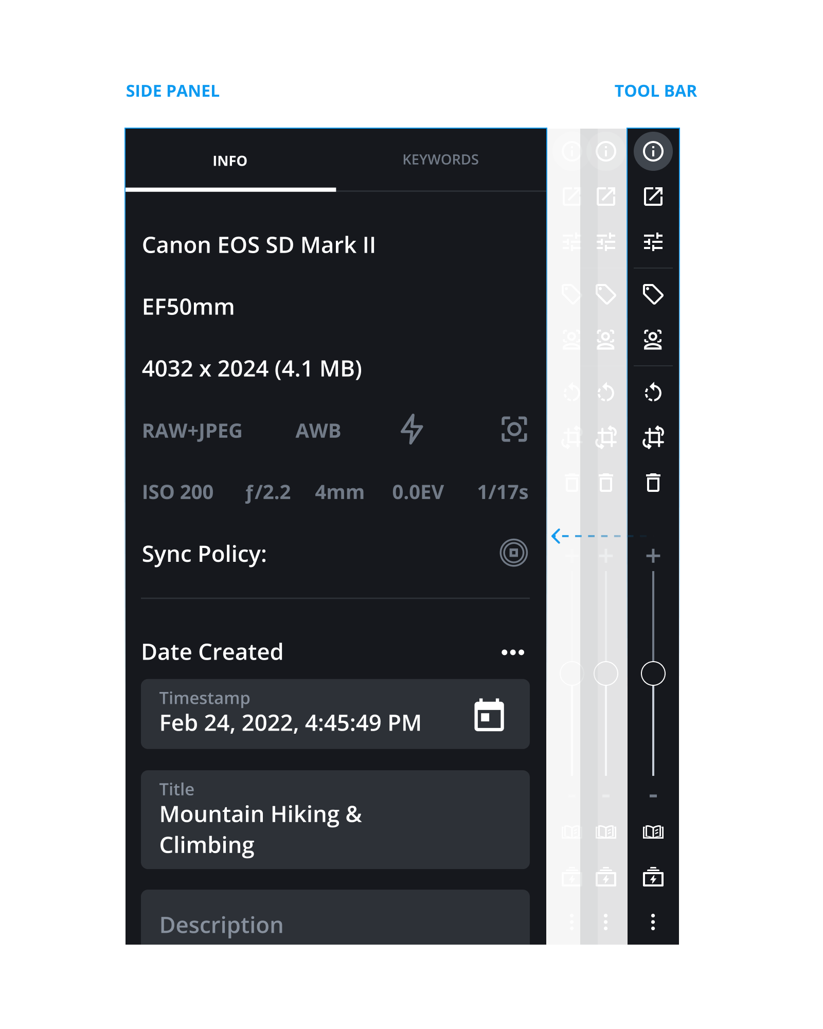
High-fidelity design of the redesigned side panel beside a fixed vertical tool bar

4

Wireframes & Visual Design

  • Wireframe every use case and its interaction flow.

  • Redesign toolbar icons, highlight section headers, and ensure typography, colors, and fields are consistent throughout the side panel, maintaining alignment with the overall app UI.

  • Collaborate with developers to ensure required functionality is in place and make adjustments as needed to align with existing features.

5

Final Solution

A right toolbar and side panel designed for clarity, easy discovery of tools, and visual consistency.
  • The right toolbar is easier to find and understand at a glance.

  • Tools adapt dynamically to the user’s selection while maintaining consistent behavior throughout.

  • All tools follow UI best practices for clearer access and interaction.

  • Right side panel sections maintain consistent typography and color usage.

  • Accordions, headers, and field layouts in the right side panel follow a unified structure.

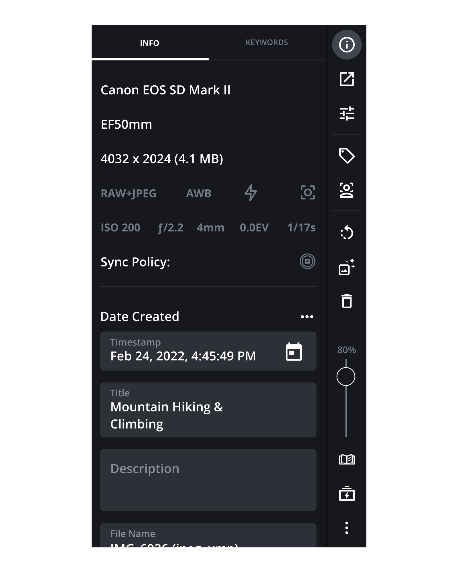
The final side panel showing photo metadata alongside an always-visible vertical tool bar
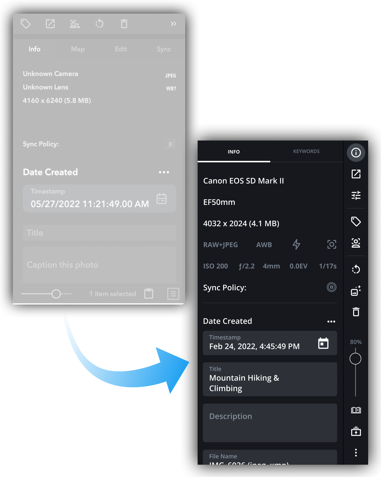
Before and after comparison of the Mylio side panel, from the original layout to the redesign

Impact & Reflection

Expected Outcomes
  • Faster tool access through improved discoverability.

  • Greater user confidence with reduced cognitive load from consistent UI patterns.

  • A more focused editing experience with fewer interface distractions.

  • A clearer visual hierarchy that supports quicker task completion.

Learnings
  • Designing around real user needs leads to more effective solutions.

  • Consistency is essential for usability and user confidence.

  • Familiar, expected patterns help reduce friction and speed adoption.

More with Mylio

And it doesn’t stop there…

During my time at Mylio, I began as a web developer and gradually transitioned into UI/UX, focusing on the application’s interface. My ability to bridge both development and design quickly became a recognized strength within the team.


Here are a few of the UI components I contributed to designing and refining in the Mylio app.

Onboarding

Onboarding became a key focus for Mylio Photos, with a smoother signup flow and guided photo import to help new users get started effortlessly.

Address Book

Starting with just a first and last name in the People view, we expanded the UI into a full address book with import capabilities and built-in email, messaging, and calling on supported devices.

Account Website

In addition to the app’s UI, I helped refresh Mylio’s account website, using Material Design elements to create a cleaner, more consistent, and developer-friendly experience.